Data Comics: My Journey of Exploration
Selected Projects | | Links: Data Comics Website
Research on Data Comics: from sequential data storytelling to interactive Human-Data Interaction (HDI) interfaces.
Overview of Data Comics for Data-Driven Storytelling
Data comics are a sequential storytelling medium that combines data visualization with the visual language of comics, such as panels, layout, and narrative progression, to communicate complex information in more engaging and accessible ways. By arranging data across panels and sequences, they guide readers through a curated narrative while also supporting interactive and non-linear exploration, such as branching paths or user-driven input.
As a form of data storytelling, data comics help bridge the gap between abstract numbers and human understanding. They place data and visualizations in context, showing why they matter through narrative structure, visual explanation, and relatable scenarios. Drawing on readers’ familiarity with comics, data comics can improve comprehension and engagement, and have shown promise in areas such as education, journalism, and public communication.
Data comics extend the potential of data storytelling by combining analytical evidence with the narrative and expressive qualities of sequential art. They can make complex data easier to follow, more memorable, and more meaningful to diverse audiences. In this way, data comics support broader public engagement with data and create opportunities for reflection, discussion, and informed action.
The Pioneering Works on Data Comics
Comics as a data-driven storytelling format were first discussed in academic literature by Segel and Heer (2010) and later implemented by Zhao et al. (2015), who developed data comics as web snapshots, as well as by Bach et al. (2016), who focused on graph visualizations, and Bach et al. (2017), who highlighted the essential elements of data comics. Building on this foundational research, my doctoral work sought to expand the design and practical applications of data comics.
In my doctoral work (2018–2022) at the University of Edinburgh, under the supervision of Dr. Benjamin Bach and Dr. Dave Murray-Rust, I investigated the creation of data comics for data-driven storytelling. My research, detailed in Creating Data Comics for Data-Driven Storytelling, pushed the boundaries of this new format and its production techniques.
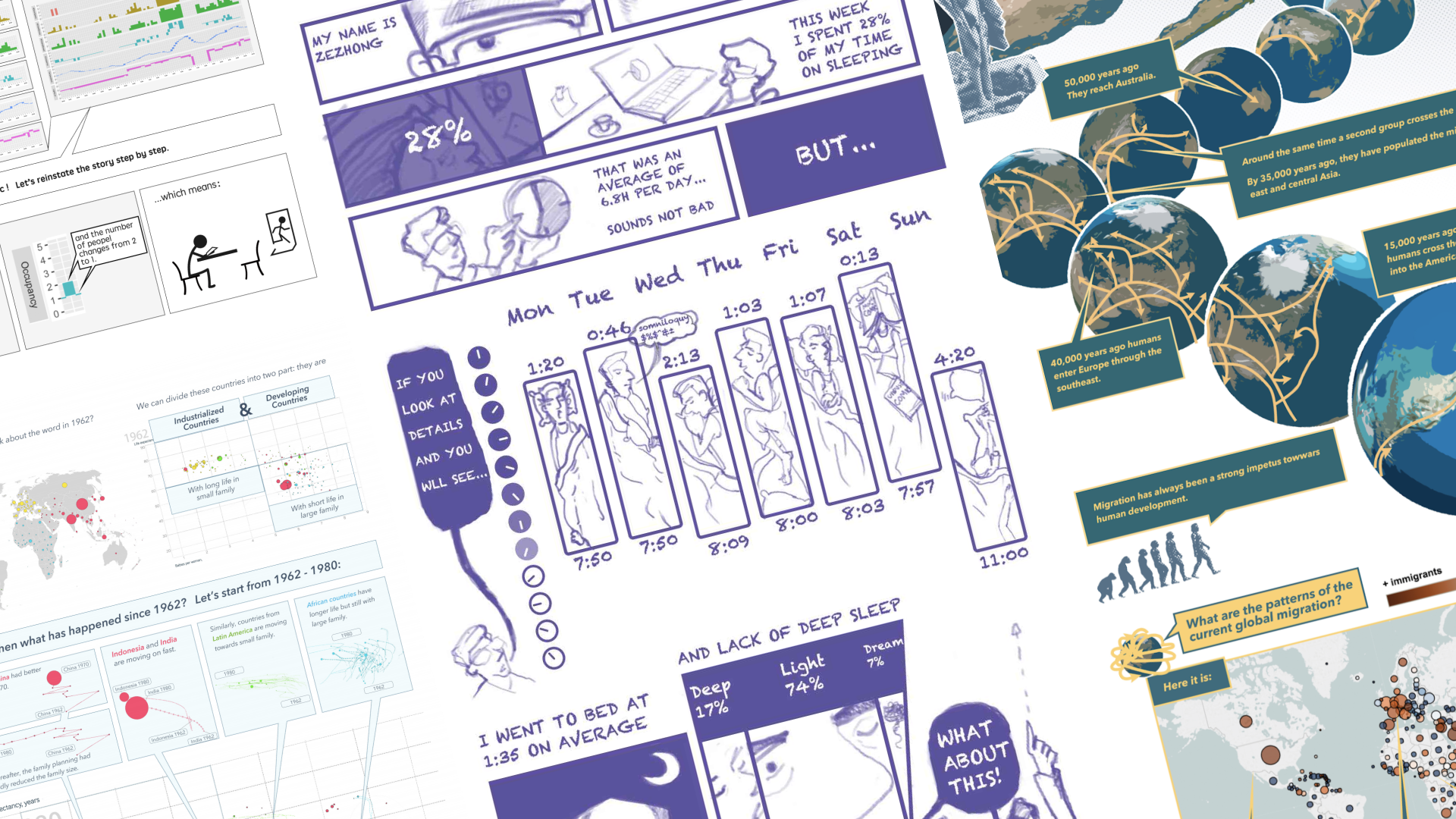
From my design and user experience background, I have always been keenly exploring how everyday experience can be enhanced through better design. This sensitivity became a driving force during my master’s study in Design Informatics, at the University of Edinburgh, where I began applying my UX design mindset to data communication. I started by sketching weekly data comics that documented my life—tracking sleep patterns, visualizing news events, and capturing newly acquired insights. Over time, this experiment evolved into a set of design patterns for data comics (ACM CHI 2018), a design space that blends the features of comics (panels, sequential visual narratives) with data visualization. To democratize access to this format, I distilled these patterns into printable, workshop-ready cards, enabling others to adopt and adapt the format. I further leveraged these tools in teaching data visualization and storytelling with data comic workshops (ACM CHI 2019 EA).


Comparing Data Comics with Infographics
As I continued exploring and creating data comics, I realized that the potential of data comics extends far beyond simply adding characters or humor. Some data comics do not include characters at all, yet still make storytelling with visualization more engaging through other qualities of the format: sequentiality, the interplay between text and visuals, visual explanations of visualization techniques, panel layout, and the transitions between panels. This led me to ask whether these features could help people better understand data and make data communication more engaging more broadly. To investigate this, I conducted studies comparing the effectiveness and engagement of data comics and infographics (ACM CHI 2019).
Using both qualitative and quantitative methods, I designed study materials with controlled conditions, including the distance between text and visualizations, the presence or absence of guided reading order, and different reading structures, to compare data comics and infographics more systematically. I evaluated these materials both in a lab study and in the street during the Edinburgh International Festival. Across these settings, participants showed a preference for data comics in terms of enjoyment, focus, and engagement.


Notably, data comics improve understanding and recall of information within stories (23% more accurate in the quizzes). The clear sequencing of panels allows readers to focus better on spatial-temporal information, while dividing the content into manageable chunks helps in memory retention. Panels grouped into rows present higher-level messages, which enhance overall comprehension. The study highlights the effectiveness of using panels to structure information and provide reading guidance.
Data Comics and Cheat Sheets for Data Visualization Techniques
Visualizations serve as foundational tools for delivering data-driven insights in data comics, yet the diversity of techniques—especially complex ones like adjacency matrices and treemaps—creates a steep learning curve for beginers. To address this, we developed cheat sheets for data visualization techniques (ACM CHI 2020)—concise, annotated explanations of specific visualization techniques—to support both first-time learners and those seeking quick references during data exploration.
Our cheat sheets cover six core areas: (1) Anatomy (core visual elements), (2) Construction (step-by-step construction of the visualization technique), (3) Visual Patterns, (4) Pitfalls (common misinterpretations), (5) Well-Known Relative (visualization techniques with similar functions), and (6) False-Friends (visually similar but functionally distinct techniques). These resources not only support creators in learnning and applying visualizing techniques but also help creators explain visualizations within comics, ensuring clarity while maintaining narrative flow.


Interactive Data Comics
While static data comics are effective on their own, adding interactivity opens new possibilities for non-linear storytelling (allowing readers to choose their own path through the content), personalization, and levels of detail. We propose a set of interactive operations tailored for data comics, such as adding or removing panels for branching narratives, changing perspectives, or providing detail-on-demand. This adaptation allows readers to actively interact with data stories, such as input data, and explore alternative narrative branches. To broaden their applicability, we developed a tool (COMICSCRIPT) to assist artists with minimal coding skills in creating interactive data comics (IEEE TVCG 2022).
This demo shows how interactive elements like alternative layouts, branching paths and data input can transform static comics into exploratory experiences.
Use Cases
Data comics have been successfully used to communicate complex information. For example, we developed data comics for reporting controlled user studies in Human-Computer Interaction (IEEE TVCG 2021), integrating text and visuals to explain study designs and insights in a way that engages both non-experts and researchers.

My current projects extend the concept to tackle pressing challenges, such as engaging public collaboration on climate change. Collaborating with climate scientists, I create data comics that communicate climate data which uses visual stories to make climate data accessible and engaging for diverse public audiences. Presented at a top international conference on permafrost (ICOP2024) and featured in the 2024 State of the Mountains Report, this project underscores the importance of clear, visual communication in bridging the gap between complex scientific data and public understanding, demonstrates how visual narratives can inspire action, and promote data literacy at a societal level.
For example, I visually explain how latent heat affects temperature changes in permafrost, using metaphors to demonstrate how diverse data sources—such as cell counts, ground truthing, and satellite imagery—are synthesized and analyzed to create a holistic understanding of a lake’s health. I integrate the explanation of data and science into captivating storylines, drawing inspiration from fiction writing to engage and inform audiences.

Through workshops, I’ve developed a structured model for guiding participants in creating data comics, allowing them to quickly grasp both visualization techniques and storytelling concepts. Creating data comics requires a combination of interdisciplinary skills such as data analysis (e.g., statistics), visualization, presentation skills, narrative development, communication, design thinking, and even drawing. By working on data comics, students are engaging with data in a more accessible format and learning how to synthesize complex information and communicate it effectively to non-expert audiences. This process helps them harness these skills in an integrated, hands-on manner, making data comics a powerful pedagogical tool for teaching data literacy, communication, and creative problem-solving.

More recently, I have been exploring data comics not only as a storytelling medium, but also as an interactive interface. Through input data comics and conversational data comics, I investigate how comics can support people in contributing data, interpreting visualizations, asking follow-up questions, and developing data literacy in context. This work extends data comics from a medium for communication into a form of Human-Data Interaction.

If you’re interested in running a data comic workshop, creating data comics for your data, or collaborating on integrating data comics into your research, feel free to contact me!
I gratefully acknowledge my supervisors, mentors, collaborators, audiences, and the students I’ve had the privilege to mentor—whose diverse insights and unwavering support have inspired every step of my journey in exploring data comics.